The graphs below show the average temperature in Eau Claire for the months of January through March of the year 2013. This data was collected by the University of Eau Claire, Wisconsin's weather station on top of a building. This shows the mean, high and low temperatures that occurred throughout these months. The horizontal axis is incorrectly labeled and should be the days of the month not months of the year... However, the data is correct.
These graphs are great tools to use as references for the data I collected throughout this semester and


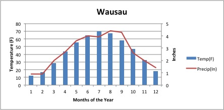
The next graphs reveal the temperature and precipitation that occurred each month of the year last year. The city is named on the top of each graph. The cities were chosen to reflect most different areas in Wisconsin. This gives a broader overview of the state as a whole and presents that information in an easy to understand fashion.


The next few charts show the rainfall that occurred each month of the year 2013. It also shows the it rained and how much it rained.


The next few pie charts show the distribution of the wind direction in Eau Claire each month of 2013. The wind shows a variety each month and during the storms that occur the wind was for the most part blew from the Eastern directions. Nothing out of the ordinary that I notice with these graphs.


No comments:
Post a Comment